Vote for Cover Art – Pretty Witches All in a Row
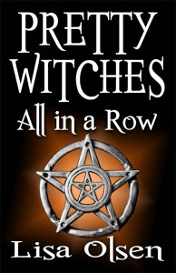
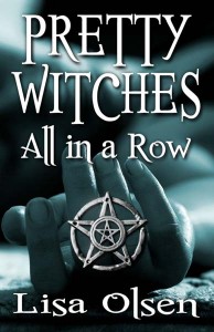
It’s that time again to give me your thoughts and feedback on the cover art for my new book coming out in October, Pretty Witches All in a Row. Anyone who comments on the covers on the website will be automatically entered for a chance to win a copy of one of my books (your choice of books). We’d also love to hear constructive criticism and ideas for how to improve them if you have any suggestions. Please keep in mind that they have to be not only eye-catching, but easy to identify when much smaller in ads and for sale on websites.
Here is a little blurb of what the book is about:
Someone is picking off a coven of witches one by one. Can Sgt. Nick Gibson and his team of detectives catch the killer before he loses the pretty witch who’s got him under her spell? Nick must cast aside his disbelief and delve into the world of the supernatural to solve the case. On hand to help is Annaliese, a member of the coven who claims to have had a prophetic dream at the exact time of each victim’s death, offering clues to the identity of the killer. Can he accept the ‘proof’ offered by unconventional means or is she deliberately leading him astray to hide her own secrets? To cloud the issue, a local evangelist is telling anyone who asks that the victims had it coming. Is religious mania the motive for murder, or is it something more personal?


I like the blue one. It seems more suggestive of the plot…fits the blurb…if you get my drift
I agree, the dead body does fit better. My big worry is that it’s too busy when shrunk down to a small button to tell what it is besides a hand.
I personally like the bluish cover with the hand (and body in the background). I think it ties in with the plot.
The way the hand is photographed, you still might be able to suggest it’s a picture of a downed person.
Pye
Hi. At first glance I thought the fingers look like they could be male. That said the one on the left reminds me of another book I’ve read but I can’t remember which (not very helpful sorry!).
I vote for the blue one too. It’s more intriguing. The other one is too generic IMO.
I like the blueish one also. I think that if it’s small, even of all I saw at first was the hand and the star, I would take a closer look. So I’m going with the blueish colored one. )
)
I like the one with the hand. The other one just gives you the witches symbol…the other one sort of tells you that something menacing is going on. Good Luck!
I like the blue one, but what if you took the orange one and gave it a drapey background like the red one on Mercy instead of the plain orange it has now? That might dress it up a bit, but still keep it simple enough to read easily on a website. I really like the pentacle!
I like the blue one as well. It makes you wonder how the hand and the pentacle are somehow connected. Is that a dead woman? Is it a sleeping woman? Did something horrible happen to her? Was she a witch? Did a witch kill her? These are all questions that might pop into your head. The orange one with just the pentacle seems less personal. If I were to be purchasing a book I am more likely to buy the cover that intrigues me. I look at the cover, then I read the back. Either way this sounds like a fantastic novel!
I also like the blue one. It attracts at first glance, and you want to look closer. I would find a way to put the pentacle symbol inside the palm of the hand, perhaps with a glowing light emanating . . . just my thoughts . . . the typeset is GREAT! Distinctive and the Lisa Olsen trademark. You recognize the lettering and say, ah–here’s another Olsen book; I like her style, so I’m grabbing another one.
I like the blue one. It looks more professional.
I like the orange cover. It’s cleaner. Catches the eye better because of the color. (My husband is an art director at an advertising company, so I learn all this advertising mumbo-jumbo.) Plus, and take this for what it’s worth, in the blue, it almost seems like the hand is giving us the finger…
Just a thought, maybe you could make something with “hands” your personal type thing for book covers since The Touch has a hand too?
Just a thought, maybe you could make something with “hands” your personal type thing for book covers since The Touch has a hand too?
I’m not going to rationalise why, I just looked at the two and my first reaction was that the Blue one with the hand was far stronger.
I like the orange one. It’s clean and sharp and not distracting, and would look good next to other books on my shelf. I’d still read the blue one, though. It’s nice and everything. I just like the other one better.