Vote on Cover Art for Mercy for the Wicked
(and enter to win a free copy of one of my books!)
Okay guys, it’s time to give me your thoughts and feedback over the cover art for Mercy for the Wicked. Anyone who comments on the covers on the website will be automatically entered for a chance to win a copy of one of my books (your choice of Angel of Mercy or The Touch, or if you’re feeling patient, you could wait for Mercy for the Wicked to come out!). I won’t say which one of these is my favorite, but take a look at the blurb below and let us know which cover you prefer. We’d also love to hear constructive criticism and ideas for how to improve them if you have any suggestions.
“How do you tell a guy that you’re being stalked by demons without sounding like a fruitcake? Even if he really cares about you, there’s bound to be that moment when he looks at you like you’re a total nutbar, right?”
Mercy is back, and in a world of trouble as factions from above and below vie for her attention, pulling her from the carefully constructed ‘normalcy’ of her life. After confessing all to boyfriend Ben, Mercy is counting on fallen angel Samael to help protect her while she deals with the sting of Adam’s abandonment. But self control has never been Adam’s strong suit. When Mercy is pursued from all sides, will Adam be able to resist playing the hero? Or will Mercy get tired of waiting and save herself? In the end, Mercy must decide, is the enemy of her enemy her friend? Or just a worse enemy?


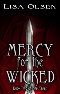
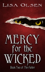
I vote for the second one with the eyes. It grabbed me right away, thus making me read the title. I didn’t see the sword until I looked more closely at it. Yup…go with the eyes.
I like the one on the right with the eyes.
I know it’s not much help, but I would go with whichever one is more ‘fitting’ to the story. I mean…if there’s no swords involved, why put one on the cover (not having read it yet, I can’t say if that’s true or not, lol). Same goes for the panther-like eyes. I think the eyes stand out better, not getting lost behind the text, but are they indicative of anything in the plot or are they in some way misleading? Only you know that
Like the eyes…but they’re very round….perhaps a bit TOO round. Love the draped background behind the sword….any way to combine those two, lol?
well between the two i like the one with the sword…that being said im still not fond of the type of sword…lol…but oh well thats my opinion
ok disregard where i said i didnt like the sword…i looked closer and i like it…
I like the first one. the second one is really nice, but that first one is still really cool looking.
I like the first one
I like the one with the sword. I don’t know what the book is about, but I just happen to like swords.
I like the sword.
I like the cover with the sword, because of the background .
.
I like the eyes, because it flows with the theme from the first book. It makes me curious to know whose eyes those are. The color and shape are very creepy- is that the intent?
I love the eyes. They are attention grabbing and creepy!
I really like the one with the sword. But the second one goes with the theme of the other book. So I choose the second one.
They’re both very well done. But the first is just a sharp pointy thing sticking upwards while the second immediately imparts a sense of menace. My vote for the eyes.
I vote for the one with the eyes, it’s creepy. If I’m being pursued by my enemy, those eyes would definitely creep me out.
2nd totally m love the eyes, what do they see, wat are they lurking at
I vote for the sword. My attention went straight to it.
Oh, love ‘em both, but I’ve got to go with the second one – the eyes keep a theme going from the cover of the first book, and they’re pretty startling and attention-grabbing. Can’t wait for this sequel!
The cover with the eyes grabbed my attention immediately. Maybe try putting the title at the top, above the rip? Then add the series information below the rip and your name at the bottom? Don’t know if that helps or hurts, but I would try it out and see how it looks.
The eyes, the color, the font all are great and give a strong feel of the story line (from what I gathered from the blurb).
I prefer the second cover because it continues the eye theme. I just think I would make the crack a little bigger, there’s a lot of empty space between the text and the eyes on both sides.
Sword, go with the sword…
I like the eyes. Eyes are always what catches my attention first. If I like the eyes, I can always check out the sword later, but it always starts with the eyes.
I like the second cover better. While both covers have a bit of mystery to them the second one has more, and goes with the story much better as well in my opinion.
The EYES have it! I vote for the eyes. They caught my attention right away, and are intriguing. Aren’t the eyes the window to the soul??? Yes, the eyes, definitely!