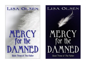
Vote For Cover Art – Mercy for the Damned
It’s that time again to give me your thoughts and feedback on the cover art for my new book coming out this month, Mercy for the Damned. Anyone who comments on the covers on the website will be automatically entered for a chance to win a copy of one of my books (your choice of books).
Please remember that this will be mostly seen against a white background on Amazon.com, since that is where I sell the most. I’d also love to hear constructive criticism and ideas for how to improve them if you have any suggestions. Please keep in mind that they have to be not only eye-catching, but easy to identify when much smaller in ads and for sale on websites.
Here is a little blurb of what the book is about:
“You’d think having an angel come to visit you would be a good thing. So why did I feel like everything was about to get ten times worse as one knelt before me?”
Mercy’s saga continues with Mercy for the Damned, Book III of The Fallen. When a new prophecy predicts a great evil if a fallen angel is allowed to remain in Midian, Mercy will move heaven and earth to free Adam from his deal with Raum. The trouble is, it’s far easier to get into Midian than it is to get out, and Adam is perfectly happy to serve out the remainder of his sentence if it keeps Mercy safe from harm. Throw in some pressure from the police who suspect Sam and Mercy of eliminating Ben, and the race is on to rescue both of them before it’s too late.


I love them both but the white cover with blue writing is just gorgeous!
I know that it’s going to be seen on a white background at Amazon.com, but my eyes are drawn to the white cover with the white feather. If you could put the same kind of white feather that’s on the white background on the cover of the black background, I might like it better. Just a suggestion.
Goodness, that synopsis makes me so anxious to read this! I’ve been missing Mercy.
Regarding the covers, I prefer the second one. I think the darker cover sets it apart, especially when viewing it on a website, and the single white feather is eye-catching.
Like I said before, I can’t wait for the release!
I’d go with the dark cover with the small feather on it. On the lighter cover, someone with visual difficulties (like me – extremely nearsighted) may not be able to tell that the textured stuff is a downy feather. I also think the darker screen will stand out better on the Amazon site.
I prefer the darker one too…though as one of the others said, if there was a way to put a feather similar to that on the white cover onto the darker one, that would be cool.
I like the white one, though I’m not so keen on that particular shade of blue.
My first impulse was the blue cover, but on closer inspection I really like the feather behind the words on the white cover. With the shadows it has some real depth and is more visually interesting.
Ok, apparently my first thought is popular…which must be a good thing, right? You should take the white cover and put it on a black background…so the upper left corner (behind the feather shadow) would be black. That would make an already fabulous cover OUTSTANDING…and still allow it to shine in front of a white website background! Love the navy against the white, too….perhaps a navy blue background instead of the black? Hmm….
Lisa,
Both covers are beautiful! However, I think the dark cover will capture more attention, especially on Amazon against a white background. So, I would choose the dark cover as the best one for marketing your book! Good luck!
I think both are great, but if I have to choose just one, it would have to be the blue with white writing. I tinkle that it’s really pretty and eye catching with just the single feather, plus it seems like it would stand out better against a white background.
I like the blue one but I too think the feather should be bigger and maybe behind the words some. Maybe you could gray it out a little bit, enlarge it and put it behind the words?